
idgard is a cloud storage solution specialized in data security, which enables protected collaboration in the enterprise environment using patented Sealed-Cloud technology.
As part of the ongoing development of the idgard web platform, my design colleague and I took over the conceptual and design overhaul of user management. The goal was to make the administration of large user bases (up to 20,000+ accounts) more efficient and to systematically address existing performance and usability issues together with product management and developers.
The trigger was recurring feedback from NPS surveys and support data, which particularly showed significant usability weaknesses in the administrative area.
Initial Situation
Over several years, NPS surveys and support evaluations had highlighted recurring issues in user management. In particular, administrators with regular usage reported:
many page switches when editing individual users
insufficient filtering and search options
low efficiency in repetitive tasks
At the same time, significant loading times occurred with large user numbers (sometimes several minutes), which led to frustration, especially for enterprise customers. Support tickets and direct feedback from IT administrators made it clear that both efficiency and transparency in the work process needed to be improved.
My Role
I worked as a UX Designer in tandem with another designer. Together we were responsible for research, conception, prototyping, and validation within agile sprints. The project team consisted of a Product Owner, frontend developers, QA, test automation, and a Scrum Master.
My tasks included:
Deriving design decisions from NPS data, support tickets, and user tests
Conception of the new list and detail view UX
Development of clickable prototypes for single and multiple user editing
Planning and conducting two user testing rounds
Quantitative Analysis
We analyzed:
NPS data over several years
Free-text comments from surveys
over 50 support tickets related to user management
A clear pattern emerged: Missing features were not the issue, but rather a lack of clarity and inefficient workflows were the main problems.
Qualitative Validation
In two testing phases with internal and external enterprise IT administrators, we examined:
Navigation behavior
Time taken for individual tasks
Perception of complexity
Understanding of filter and selection mechanisms
During the course of the project, we partially switched from moderated to unmoderated tests using the tool Maze to get feedback faster and with a larger sample size. This noticeably increased the speed of iteration. Maze allowed us to track the mouse movements and clicks of our test subjects and generate heatmaps based on this data, which reflected the users' focus.
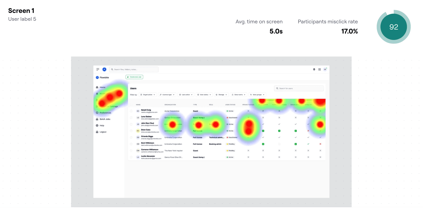
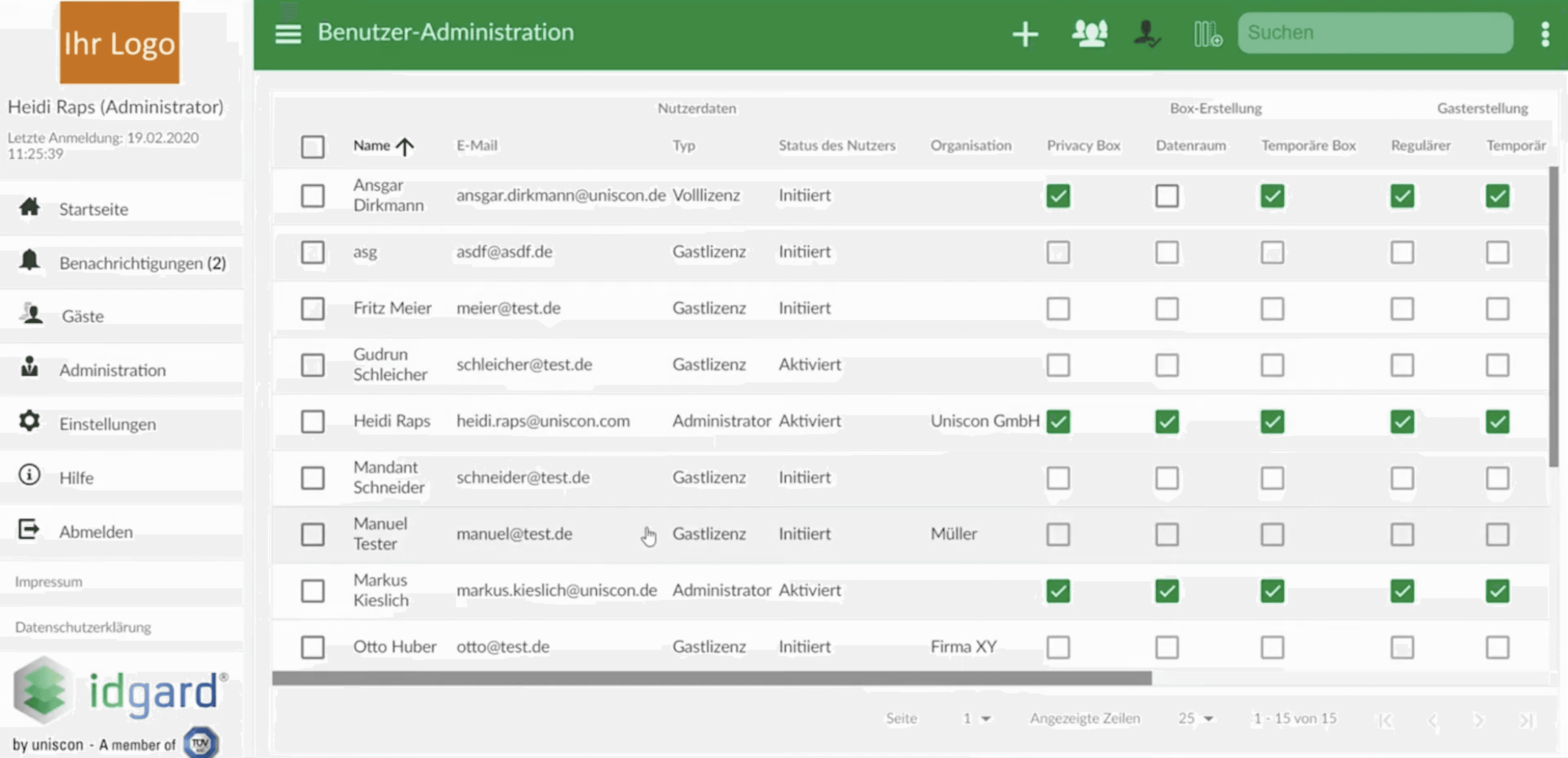
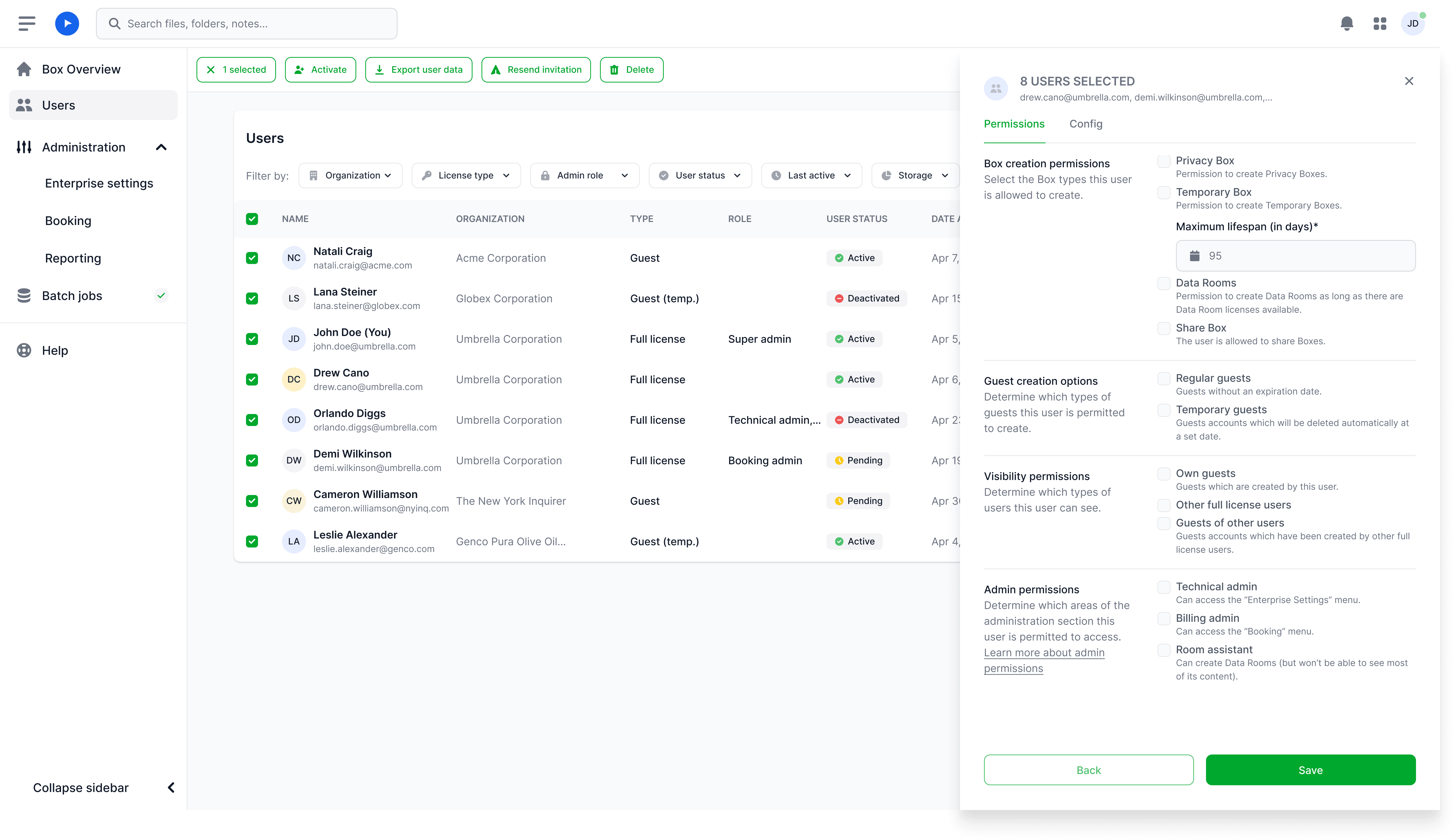
Central Insight: It was clear that the user list is perceived as a central working surface and page changes disrupt the workflow. Tasks such as role assignment, license allocation, and status verification of multiple accounts were particularly time-critical.
The new user management system has been designed so that administrators can find, edit, and control users more quickly.
1. User Details Without Losing Context
What Has Changed
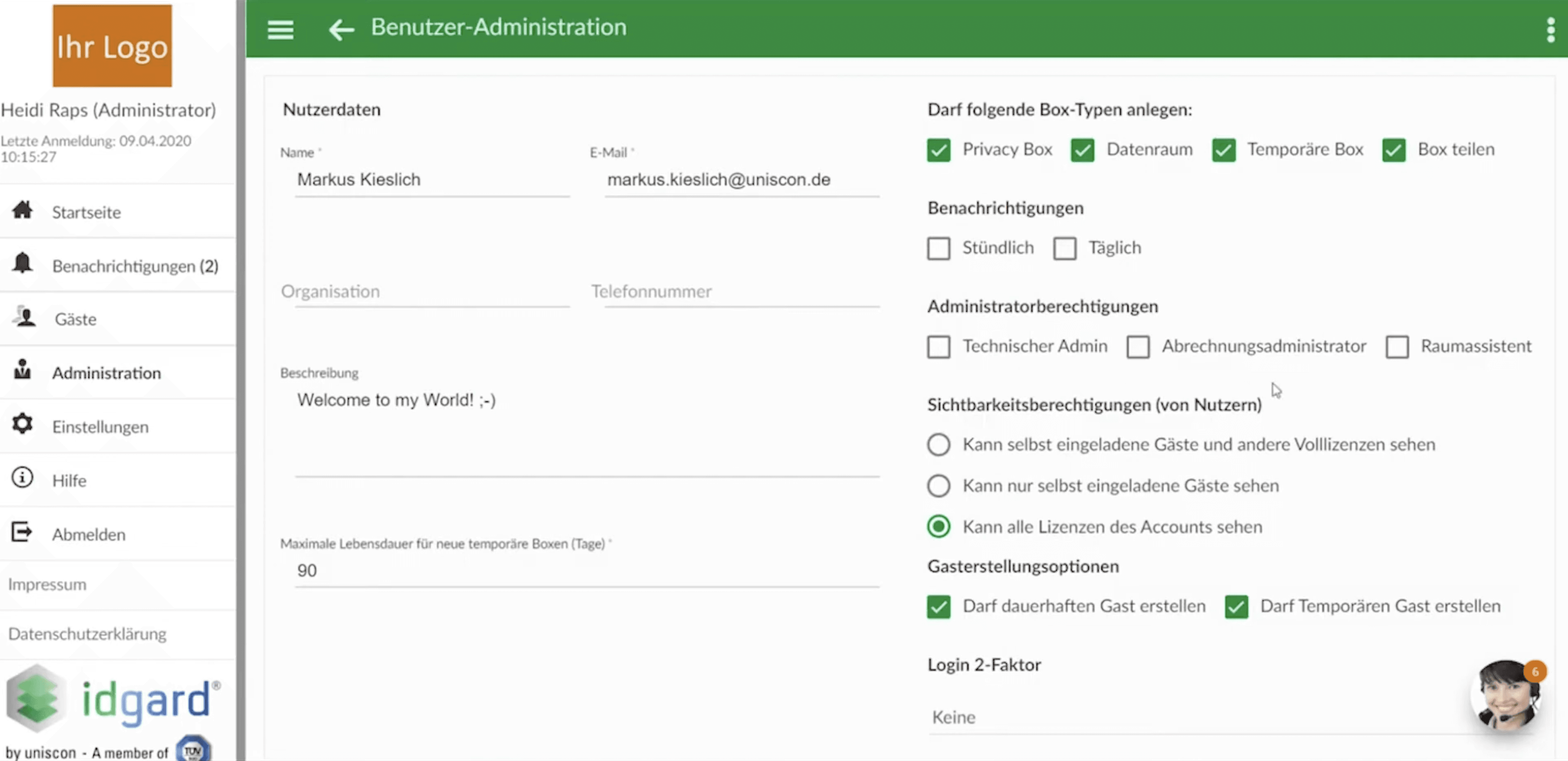
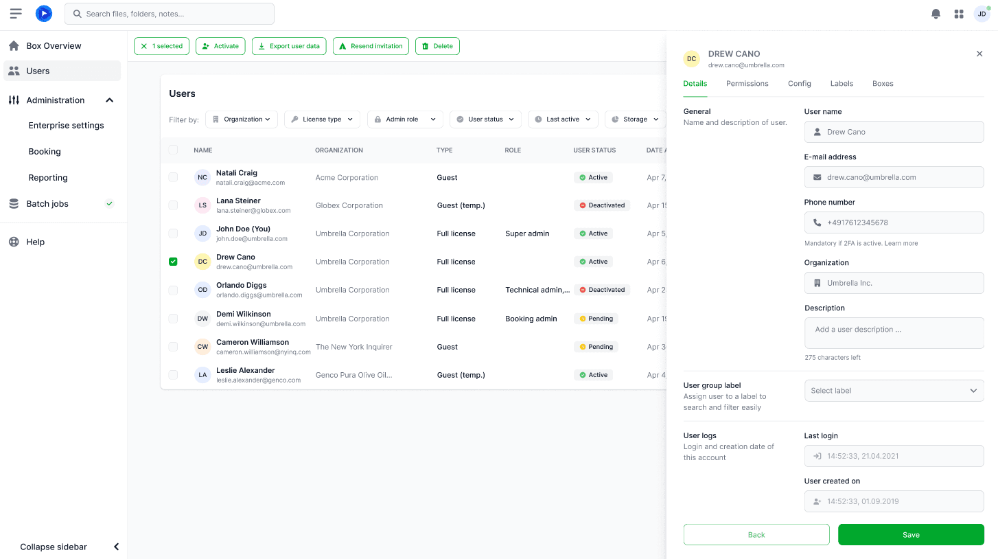
Instead of separate detail pages, a side-drawer editing view has been introduced. Administrators can view and edit users without leaving the user list. This reduced navigation steps and improved orientation in the workflow.
2. Context-Sensitive Actions and Efficient Handling of Multiple Users
What Has Changed
When selecting one or more users, the interface adapts contextually: relevant actions are highlighted, irrelevant ones are hidden.
Why This Is Important
Clearly Recognizable Next Steps
Especially Helpful with Large User Lists
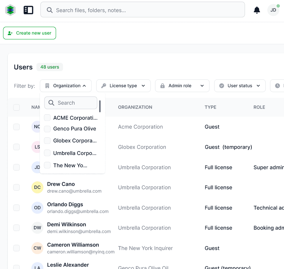
3. Introduction of a structured filter bar for targeted user selection
What has changed
User research revealed that administrators often work with large user lists and frequently need to filter by specific criteria (e.g., activation status or company affiliation).
To specifically support this workflow, we introduced a persistent filter bar above the user list. The goal was to make typical administrative tasks solvable not through navigation, but directly in the context of the list using combinable filters.
4. Adjustment of the Design System
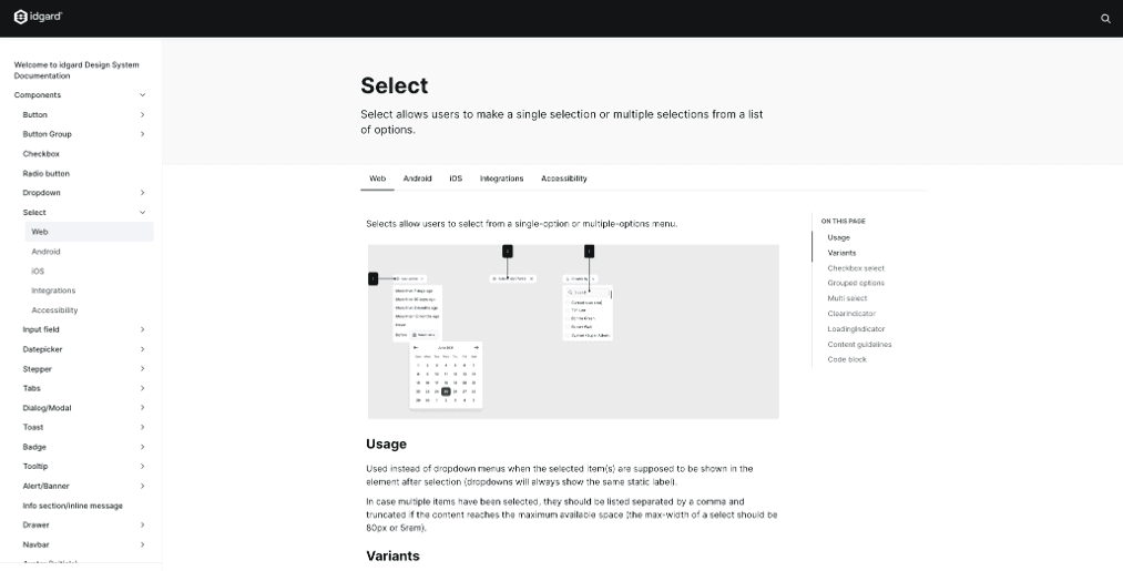
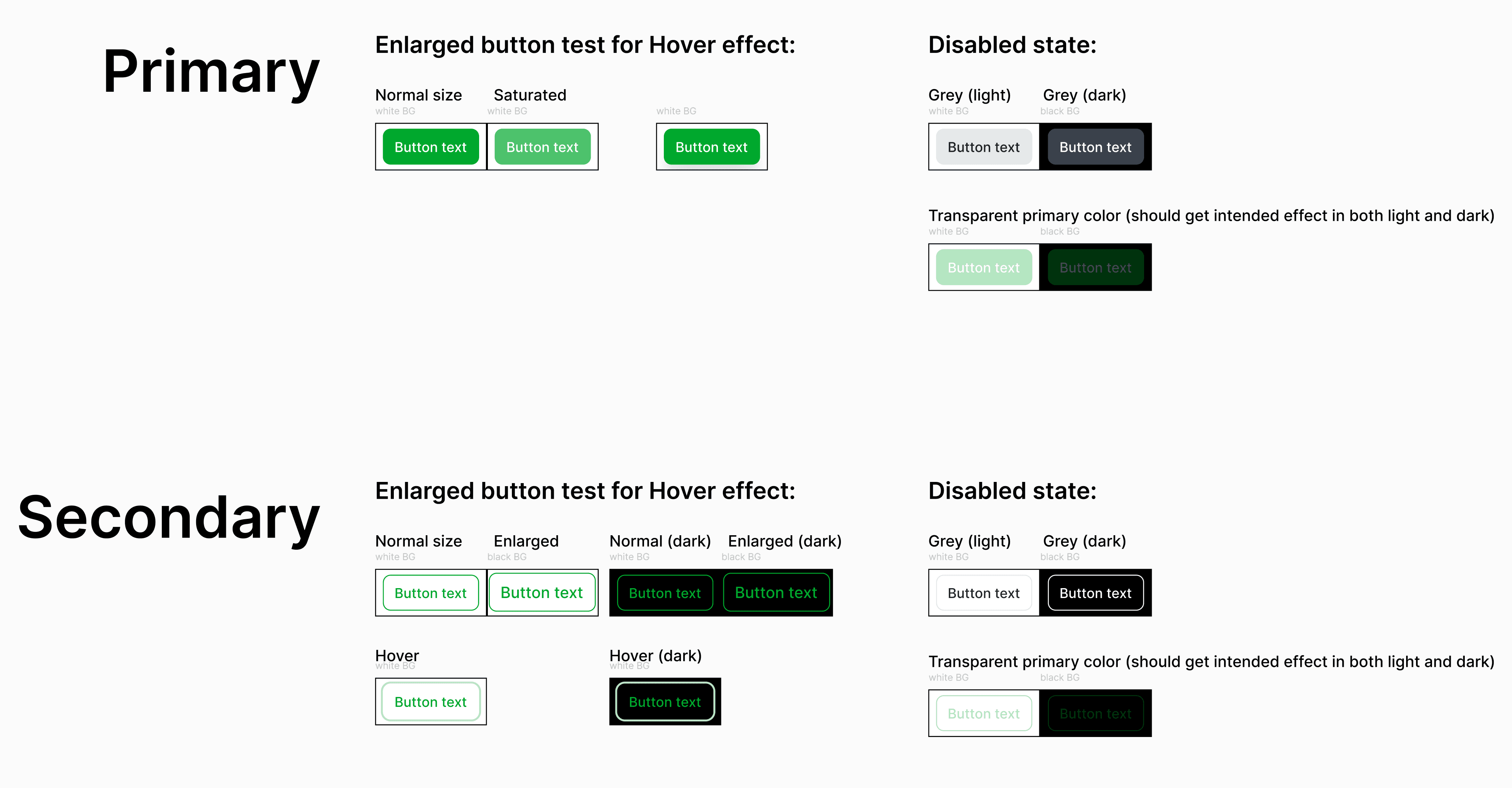
The previously used Material-UI library reached its limits in visualizing complex states and specific enterprise requirements. In the course of revising the user management, we therefore decided to introduce Flowbite as the new component basis. For a structured handover to development, we documented components, animations, and design rules in Supernova to ensure consistent implementation.
After the release, a clear effect was observed:
Higher satisfaction of administrators with user management (Ø 3.4 / 5) representing an improvement of 16% compared to previous years
Positive feedback from two user test rounds and from existing customers
Noticeable relief for support and our Customer Success Managers
The UX of the administrative workflows has shifted from a limiting factor to a positive differentiating feature.
The project showed me how important it is to adapt complex enterprise interfaces to the actual workflows of the users. Small changes like sidebar views or filter bars can significantly increase productivity without changing the existing system logic.
Additionally, I learned how valuable a systematic testing infrastructure is in an agile environment. The switch to unmoderated tests allowed for faster iterations and a broader validation base.
At the same time, it became clear to me that enterprise UX often has to be deliberately designed to be restrained: clear typography, reduced colors, and consistent layouts create trust and facilitate daily work.
