
The Bavarian Police planned, as part of a digitization initiative, to complement the previously paper-based dispatch of penalty notices with a digital solution. The solution was rolled out across the country after a successful pilot phase and is designed for several tens of thousands of cases per month.
The aim was to reduce administrative efforts, shorten processing times, and provide citizens with quick, secure, and barrier-free access to their documents (without additional registration or complex interactions).
Project Context
The project arose during my work at Uniscon GmbH, a provider of operator-secure cloud solutions for authorities.
On the backend side, the existing on-premise solution “Secure Box Bavaria” was to be used, in which the penalty notices are securely stored. The frontend – that is, the citizen portal for viewing the warnings – did not yet exist and needed to be newly designed.
As part of a cooperation between Uniscon and the Bavarian Police, I was involved in the project as a UX Designer and was responsible for the conception and design of the portal.
My Role & Responsibility
I was responsible for:
Conceptualizing the user flows and information architecture of the portal
Wireframing and high-fidelity design for desktop and mobile
Designing central UI components
Ensuring accessibility according to WCAG criteria
Coordination between technical, legal, and user-centered requirements
The Challenge
The sending of fines in Bavaria was previously paper-based. Citizens had no way to view their warning digitally or retrieve documents online.
At the same time, a government online offering is subject to strict requirements for:
Data protection
IT security
Accessibility
Formal legal certainty
The challenge was to develop a digital solution that meets these framework conditions while remaining understandable, trustworthy, and easy to use for citizens.
Goals & Framework Conditions
The portal should:
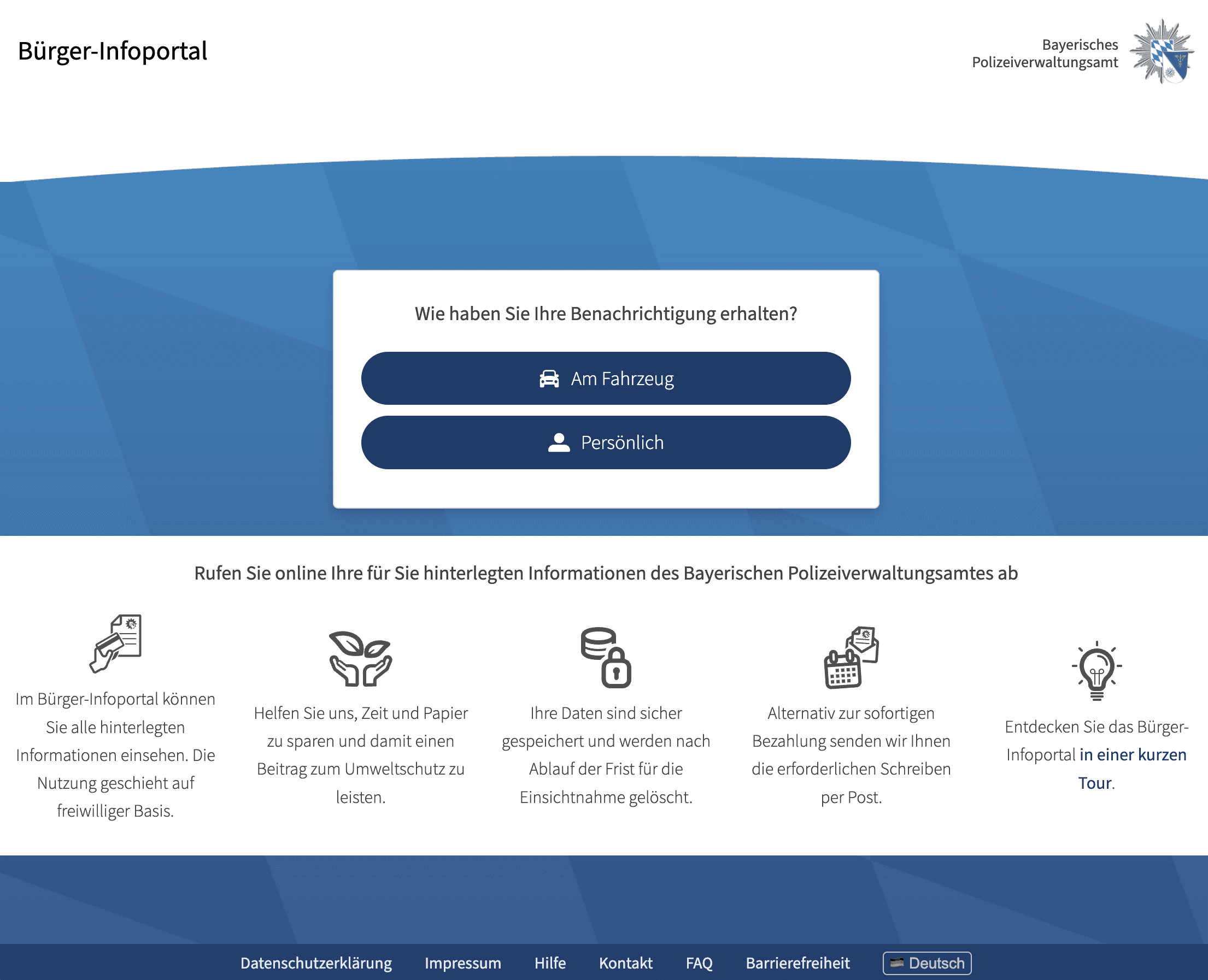
Be usable without registration
Be quickly comprehensible (even for one-time use)
Be designed to be accessible
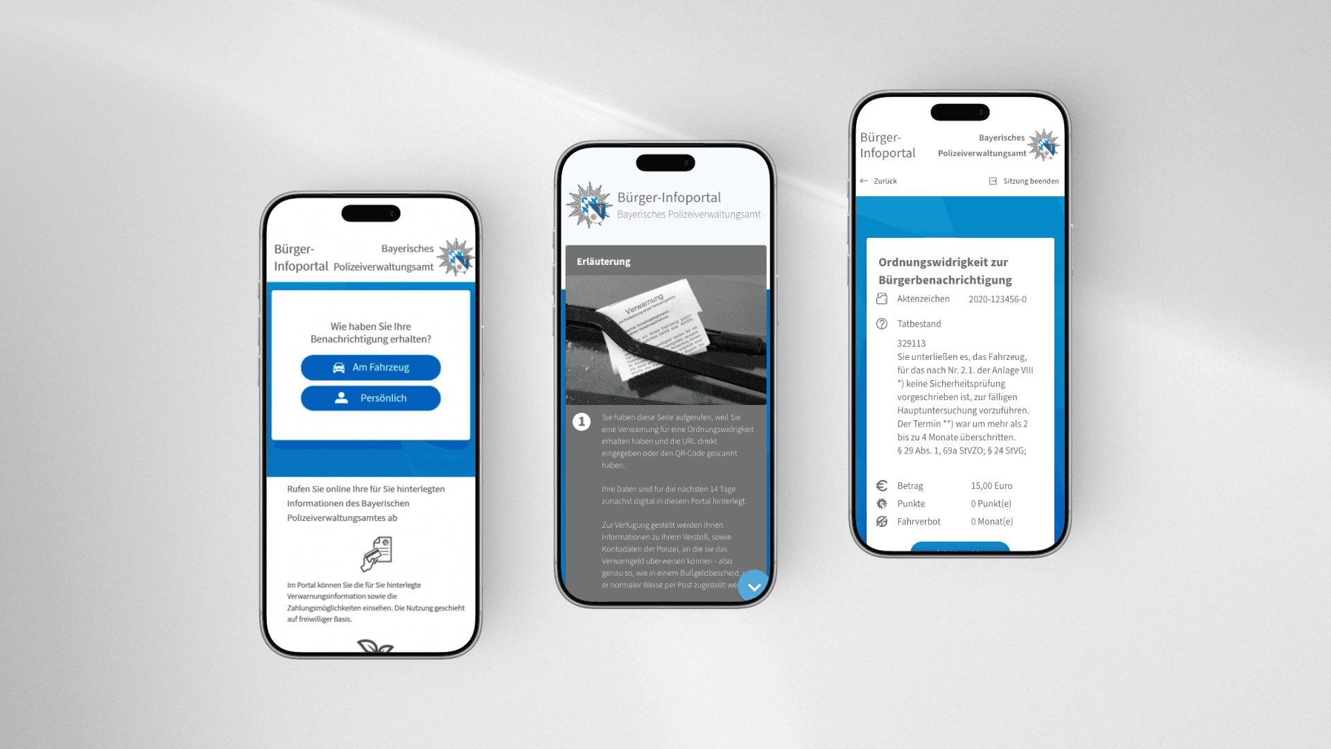
Function equally well on mobile devices as on desktop
Visually reflect the identity of the Bavarian Police
Classic user interviews were not possible in the project context. The conception was therefore based on a defined catalog of requirements from the Bavarian Police and best practices for government online services.
A particular focus was on implementing WCAG-compliant accessibility and visually aligning with the existing identity of the Bavarian Police to ensure trust and recognizability.
In the first phase, I developed low-fidelity wireframes to define the basic structure of the portal:
Login area
Page hierarchy
Information structure after login
Navigation logic
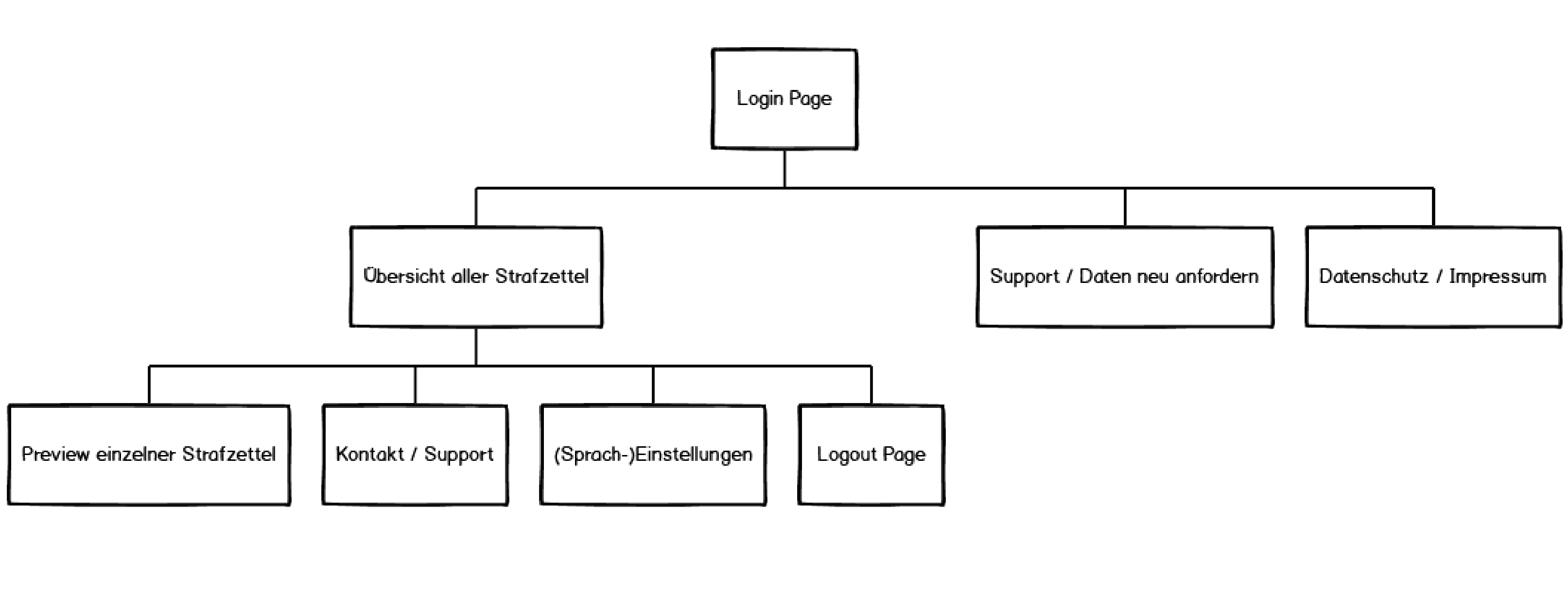
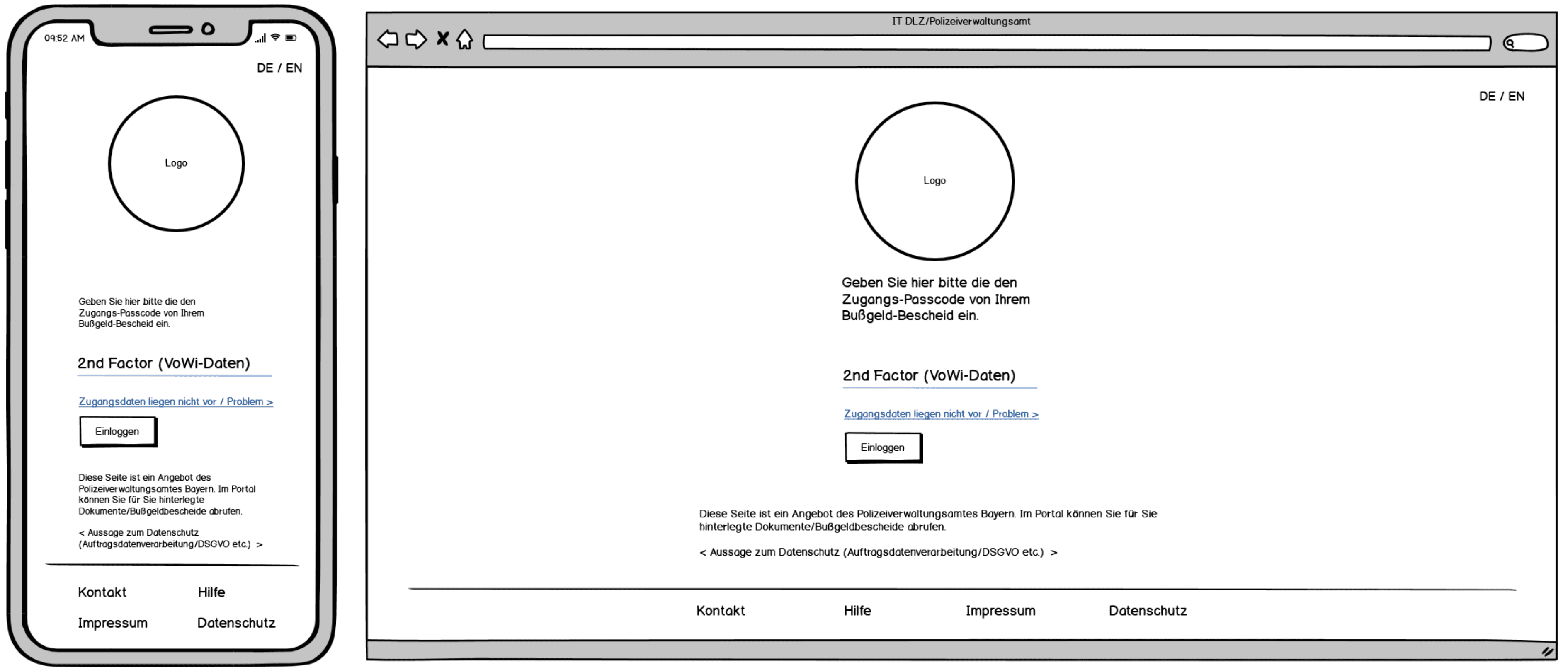
At this stage, it was not yet fully defined how the user verification should take place, so an input field for the identification number was initially not part of the wireframe.
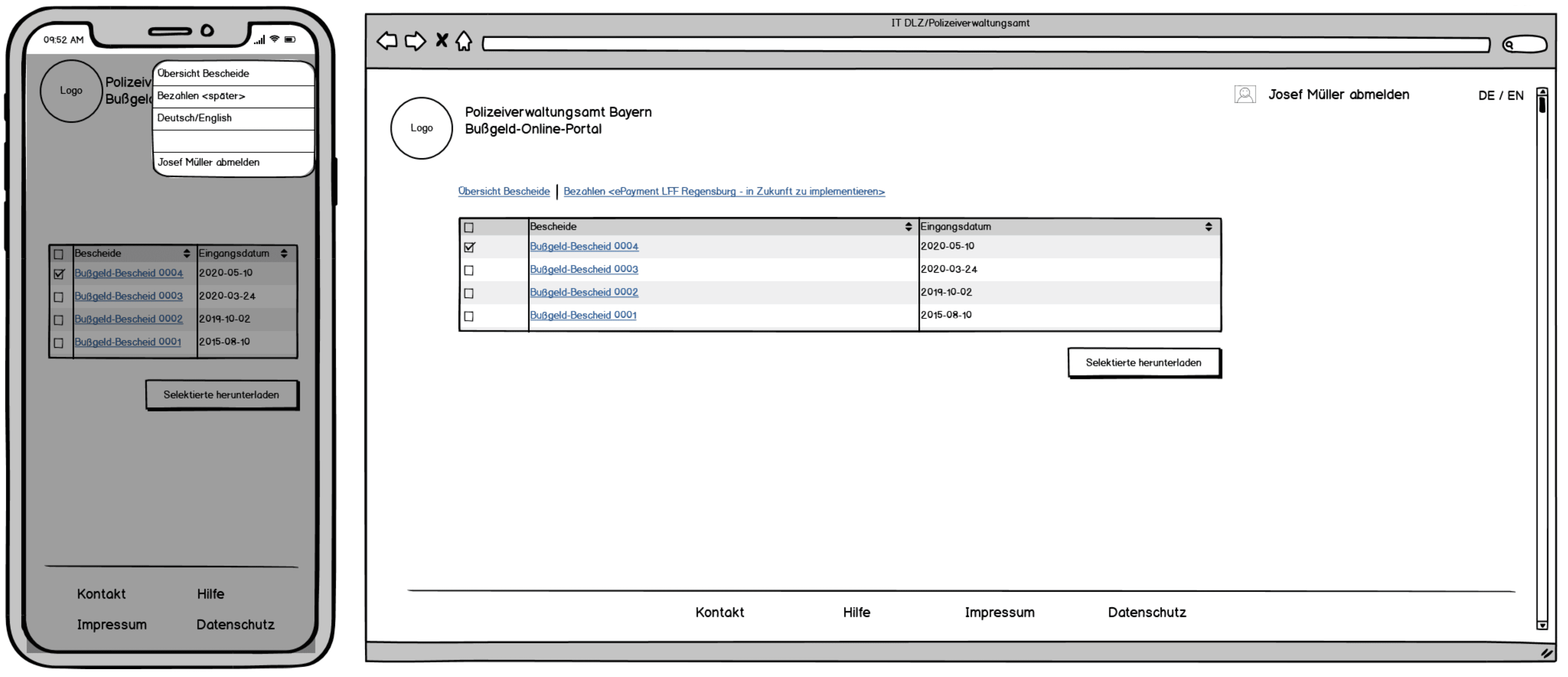
At that time, we still assumed that a user could potentially view multiple violations at once. Accordingly, the early concept after logging in provided for a list view of multiple violations, from which individual cases should be opened by clicking.
Concept Adjustment
In the further course of the project, we critically examined the usage scenario together.
It became clear:
It is very unlikely that citizens will commit multiple parking violations that can be accessed digitally in a short time frame.
Furthermore, it was planned to create a separate digital access for each individual violation.
The list view would thus almost always contain only one entry in practice, which would mean an additional navigation layer without real added value.
At the same time, we clarified the login procedure:
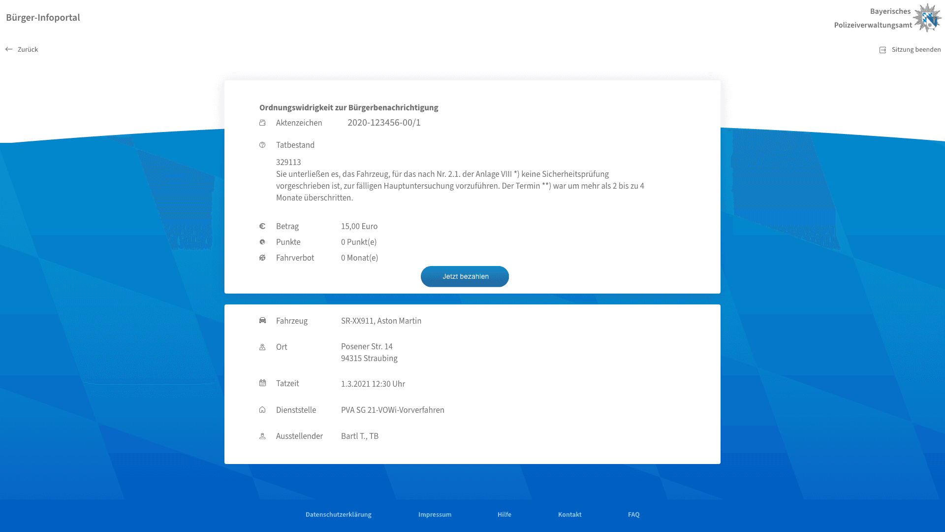
The verification should be carried out via the vehicle registration number and an individual code on the ticket. This meant that the login area had to be expanded accordingly.
Based on these insights, I simplified the structure.
High-Fidelity Design
In the high-fidelity mock-up, the structure was therefore intentionally reduced:
After a successful login, users now go directly to the detail view of an individual violation, without a preceding list view.
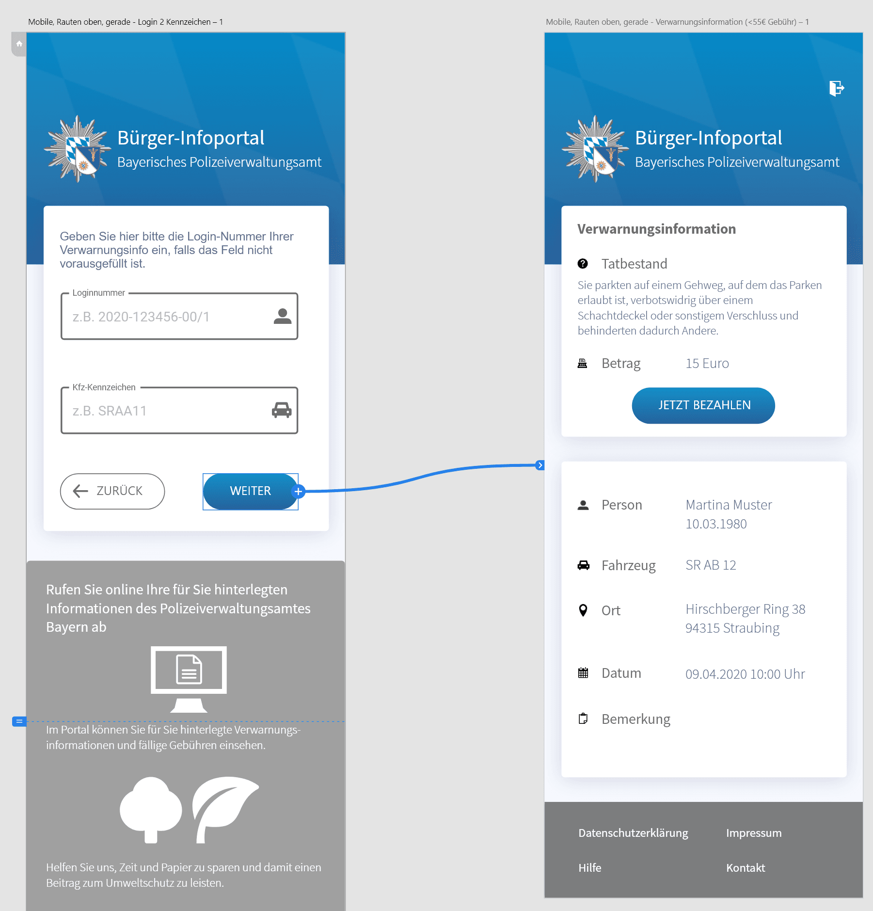
The page clearly presents relevant data such as case number, facts of the case, amount of the fine, and more.
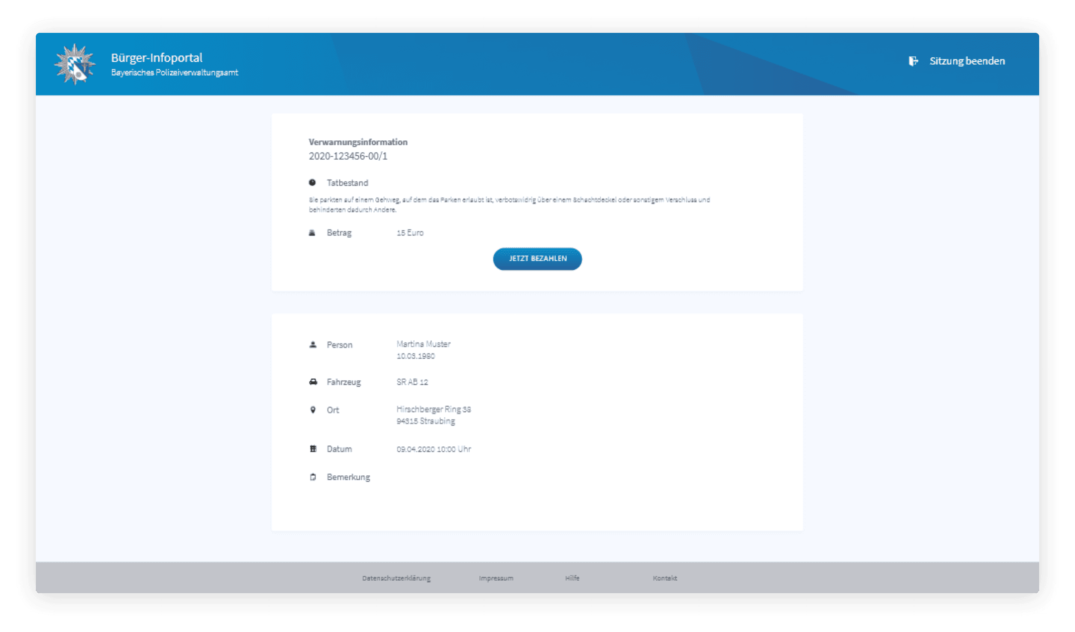
This simplification reduced the click depth and avoids unnecessary navigation steps.
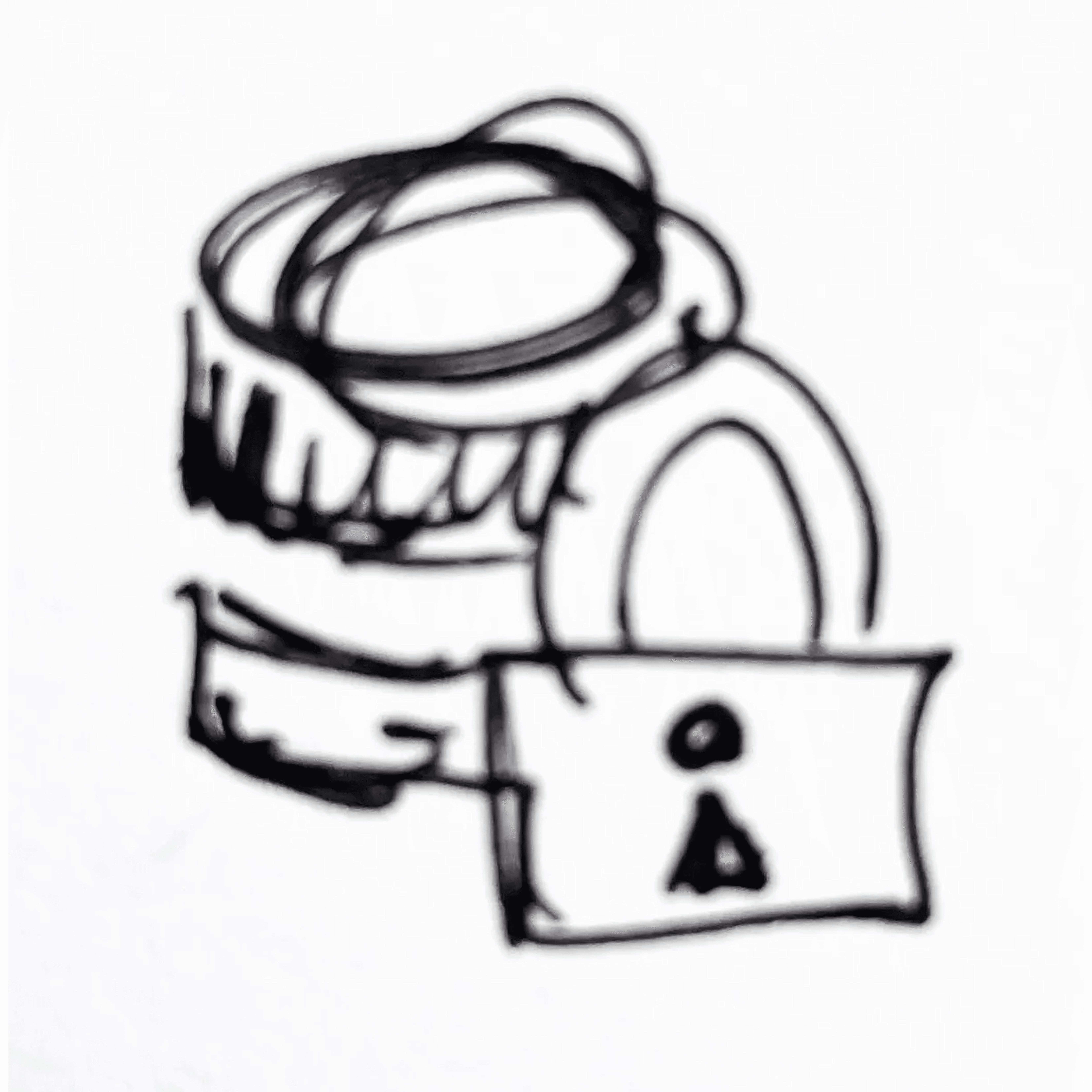
Icons
The visual design is based on the existing visual identity of the Bavarian Police to ensure recognizability and seriousness. Additionally, I created illustrative icons in Adobe Illustrator to make central statements – such as the purpose of the portal, data security, or environmental aspects – quickly comprehensible and to support textual content.


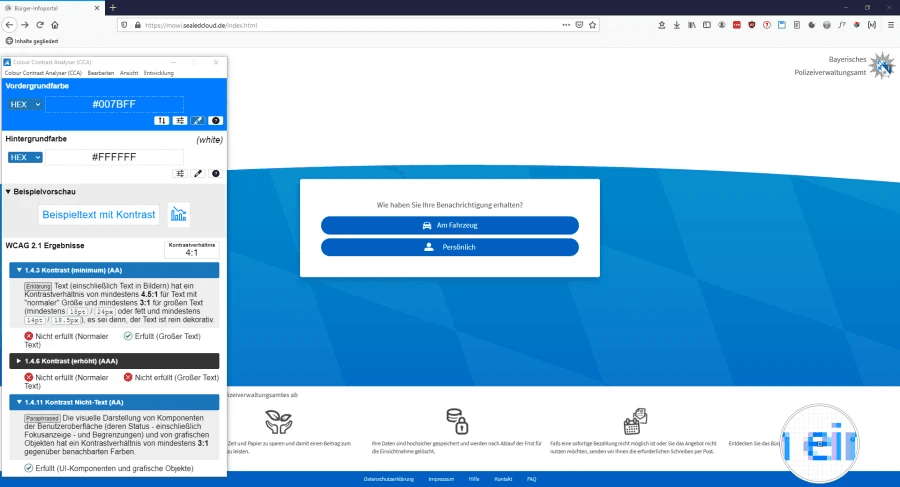
Quality Assurance & Accessibility
A central part of my work was the systematic examination of the application based on WCAG and BITV guidelines.
The following were examined:
Keyboard operability
sufficient color contrasts
traceable focus management
semantically correct markup for screen readers
Identified optimization potentials were prioritized and weighed in terms of implementation effort and benefit.
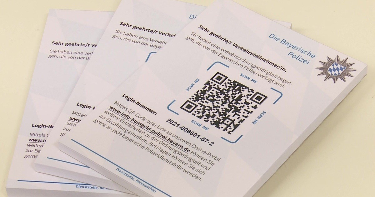
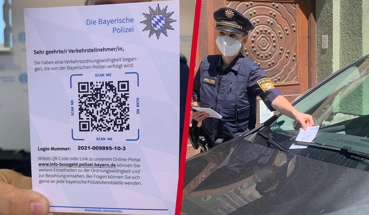
Design of the Print Template
After finalizing the website mock-ups, I was additionally commissioned to design the print template for the QR code parking ticket. I created this in Adobe InDesign. To create a recognizable connection between the physical parking ticket and the digital portal, I integrated the diamond pattern of the Bavarian flag – reduced and optimized for print – into the template as well. This created a visual link between the analog and digital touchpoints.
The citizen information portal developed in the project has been successfully transitioned to regular operation after a pilot phase. The system is designed to handle several tens of thousands of cases per month. The use of the portal is voluntary; alternatively, delivery by mail is still provided. However, by digitally providing fines and payment information, the administrative effort for creation, printing, and postal delivery has been reduced. At the same time, affected individuals receive faster and more transparent access to their warnings, regardless of location and device.
The system is complemented by a mobile data collection app for police officers, creating a fully digital process.
The project has made me realize how much UX work in the public sector differs from traditional product projects.
Working with requirement catalogs, close coordination with development and project management, and the continuous validation of design decisions in the context of the existing system landscape have sharpened my perspective on realistic, sustainable long-term solutions.
In hindsight, earlier and closer involvement of real end users could have provided additional qualitative insights, such as the comprehensibility of individual terms or the perception of the login process. At the same time, I learned that in highly regulated projects, alternative approaches to user needs are also necessary. In this case, the systematic examination of accessibility played an important role in identifying and reducing obstacles to use at an early stage.
