
idgard is a secure cloud collaboration platform focused on protected data exchange in the enterprise environment.
Due to the significantly increasing use of Microsoft Teams during the Corona pandemic, there was a need to integrate idgard directly into MS Teams. The goal was to develop a standalone Teams app that maps key functions of the web application – albeit under significant time pressure and with a greatly reduced set of features.
Since only about 20% of the existing features could be implemented within the given timeframe, the central challenge was to identify the most relevant functions for users and transfer them to a new, platform-specific interface.
Initial Situation
Many existing customers used MS Teams extensively for their internal communication. At the same time, there was skepticism, especially in the education and public sector, regarding the use of OneDrive for sensitive documents.
Therefore, an idgard integration into MS Teams should:
enable secure data exchange within existing Teams workflows
reduce the barrier for switching between chat and file sharing
simultaneously limit development effort and time-to-market
The existing web app could not simply be embedded. Microsoft recommends standalone, platform-compliant applications for Teams. Therefore, the app had to be re-conceived and technically redeveloped.
My Role
I was responsible as a UX Designer for:
Feature prioritization from the user's perspective (together with the Product Owner)
Conceptualization and prototyping of the team app
Coordination with the Product Owner and developers
Validation through user testing
Quality assurance from a UX perspective
Since only a fraction of the existing web functionality could be implemented, the focus was initially on identifying the most important usage scenarios.
We had conversations with five existing customers who had expressed early interest in a Teams integration. Additionally, we validated prioritized features in click dummies with the same user groups.
It became clear:
Administration functions were of secondary importance for the Teams variant
The simple navigation through folders ("boxes") was of central importance
Permissions when creating folders were business-critical
Files should be able to be shared directly in the Teams chat
A reduced and understandable file explorer was clearly preferred
Conceptual Guiding Idea
The Teams app was not designed as a scaled-down web version, but as a focused work tool within the context of Teams. Instead of aiming for feature parity, we concentrated on three core areas:
Navigating & managing files
Inviting and authorizing folder members
Direct sharing in chat
1. Use of Microsoft Fluent UI
To build trust and ensure seamless integration, we oriented ourselves according to Microsoft's Fluent UI Design System.
Existing idgard UI patterns were deliberately scaled back in favor of platform-compliant components and interaction patterns. This facilitated both the technical implementation and acceptance among users.

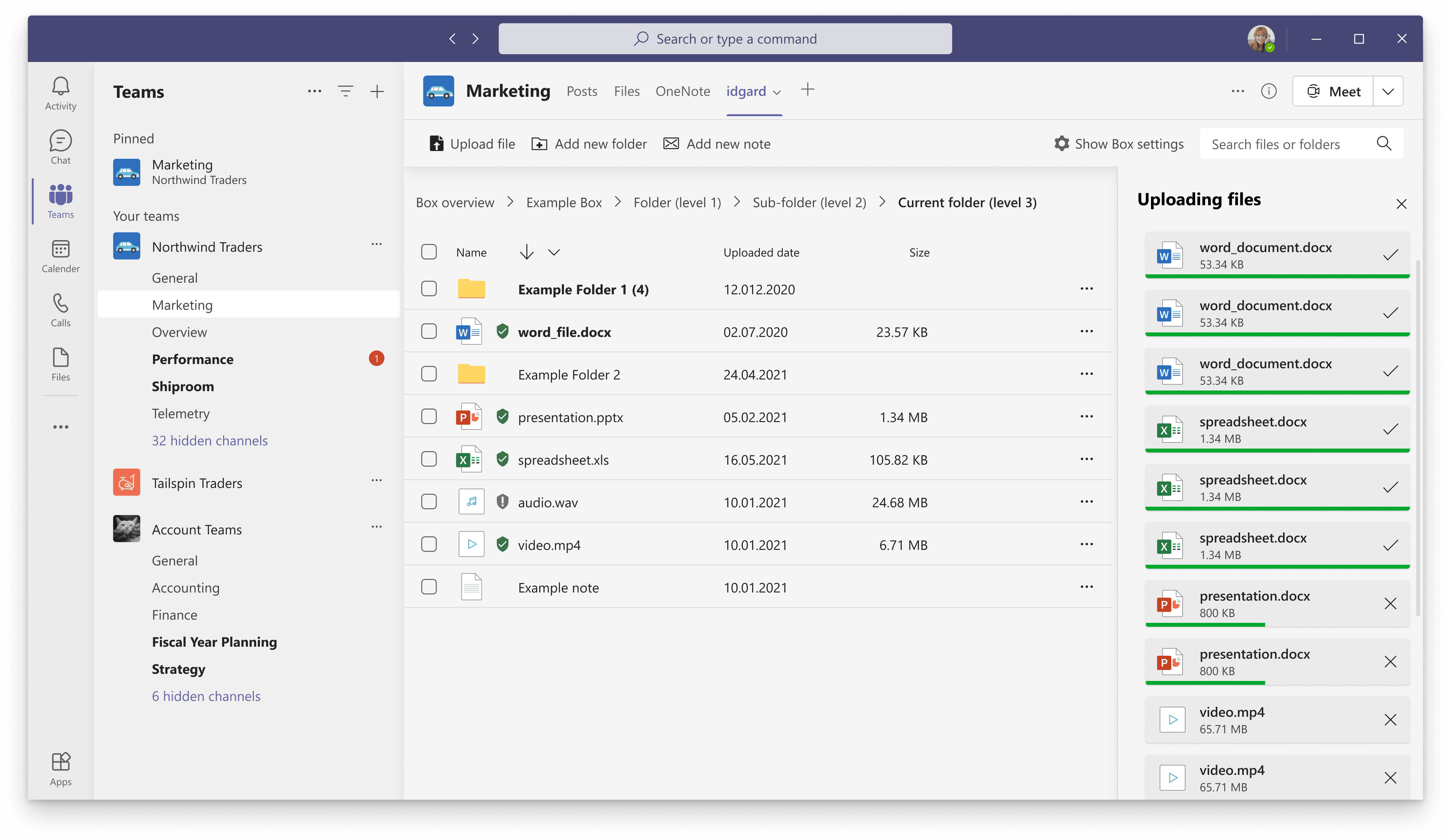
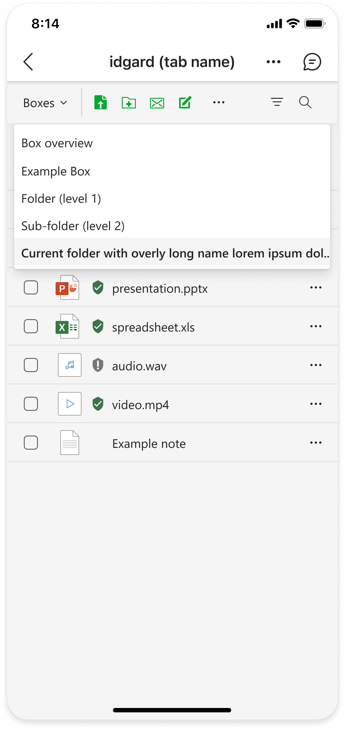
2. Reduced File Explorer
The File Explorer has been deliberately simplified:
Fewer columns
Focus on filename, type, and security status
Breadcrumb navigation instead of tree sidebar
The removal of the left navigation bar created space and improved responsiveness, an aspect that was not sufficiently considered in the original web version.
User tests showed faster orientation and reduced search times for tasks within the file view.
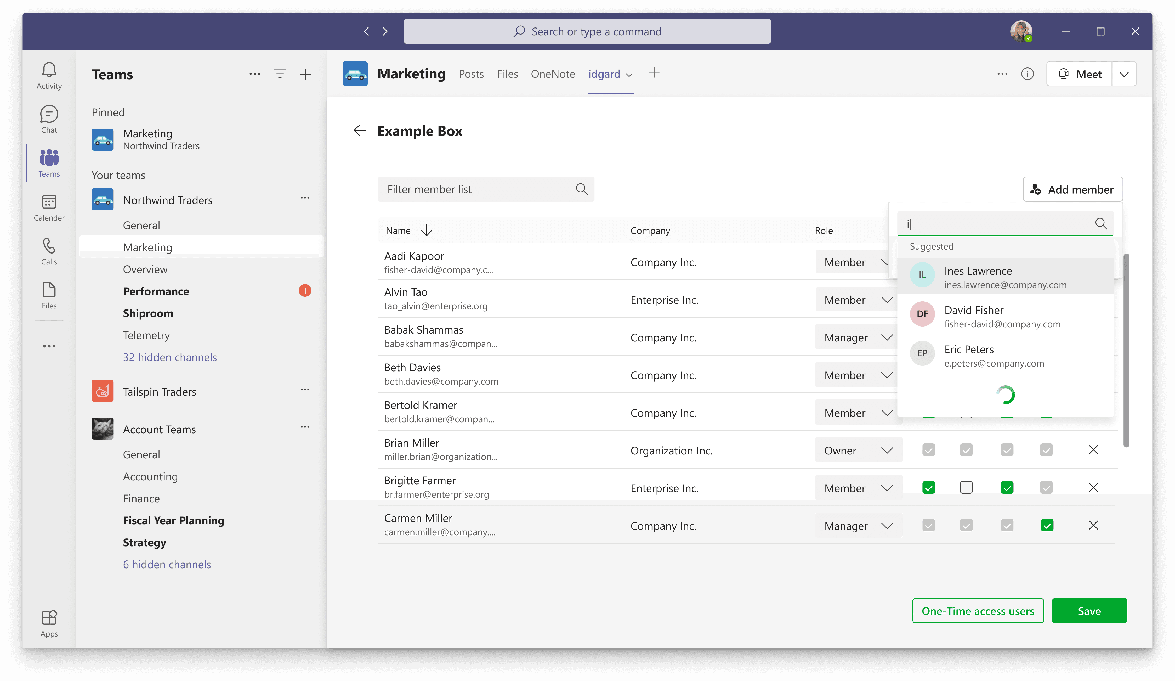
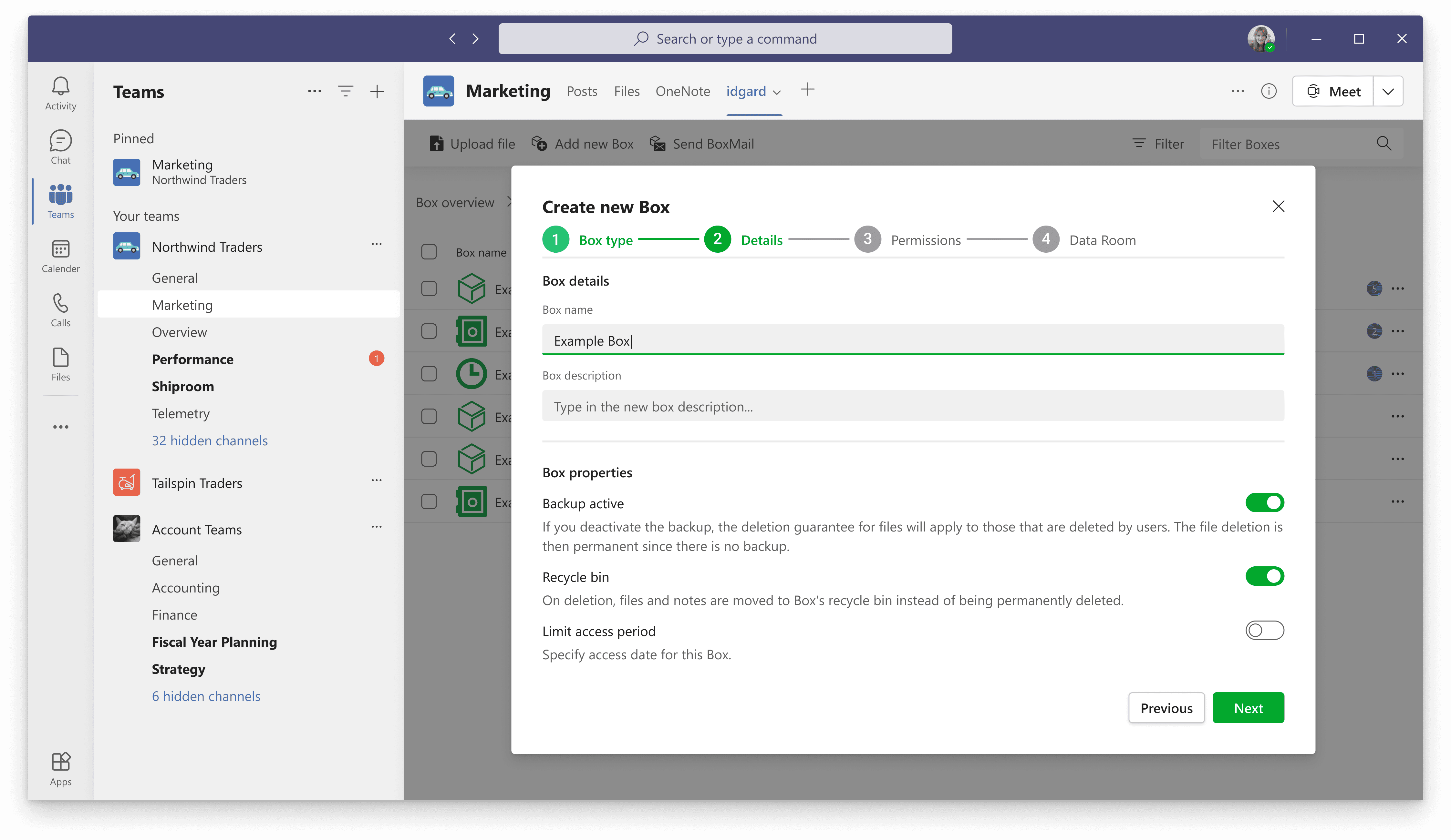
3. Newly Designed Member Management
The member management has been fundamentally simplified.
Instead of displaying members and non-members in a common table, the new view exclusively shows existing members. New users can be invited through an autocomplete search.
If no existing account is found, the creation of a guest account is offered immediately.
In validation tests, typical tasks such as adding or adjusting permissions were completed about 33% faster than in comparable tests of the web interface.
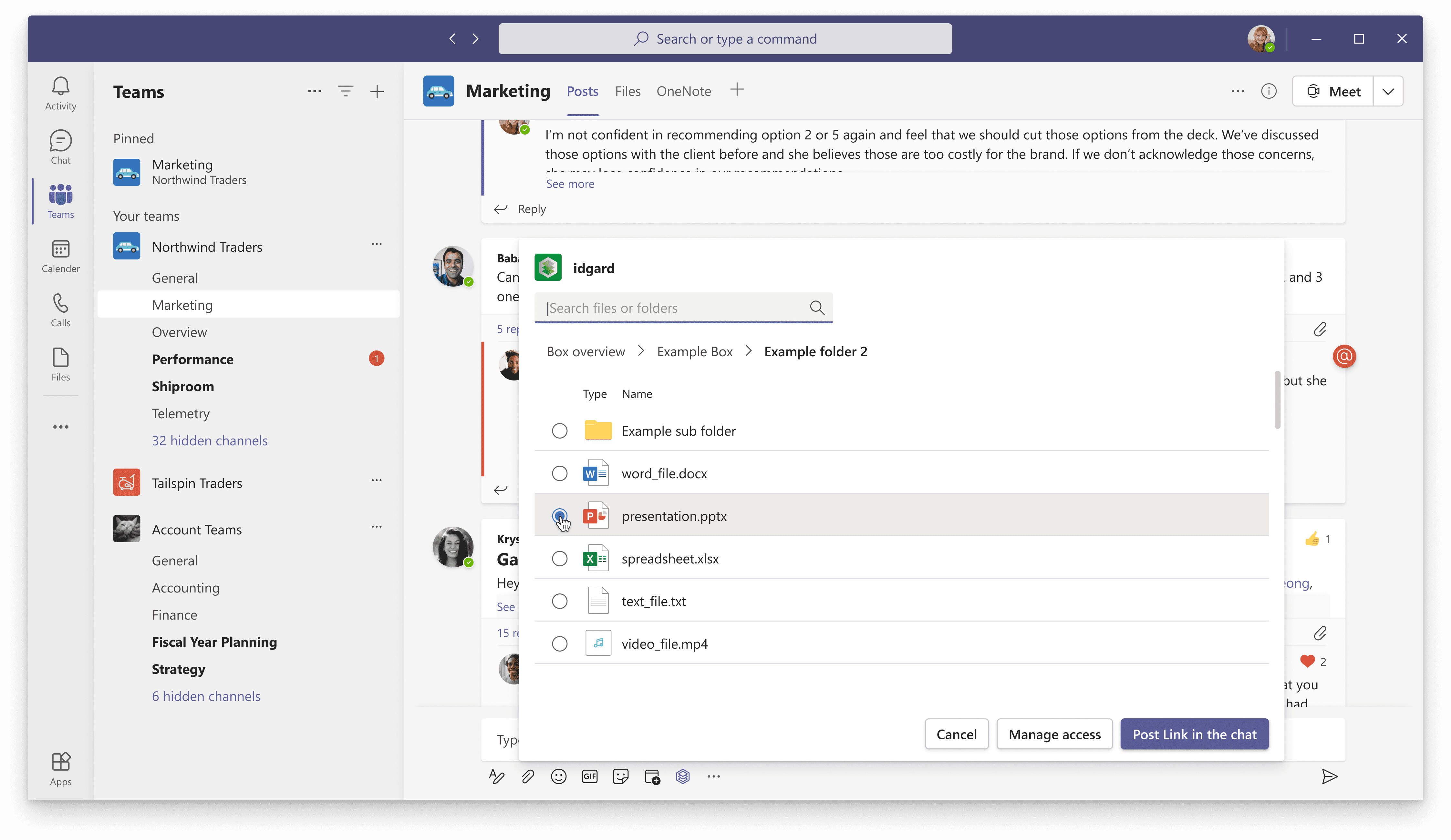
4. Message Extension for Direct Sharing
To avoid media disruptions, we additionally developed an idgard Message Extension. Users can search for files directly from the chat and insert them as a link without having to switch to the app tab.
In tests, this feature was intuitively found by 75% of participants and successfully used in under 25 seconds on average.
5. Deliberate Feature Omission: Data Rooms
A feature important to many customers (so-called "data rooms" with complex permission inheritance and advanced security options) was not implemented for reasons of time and complexity.
Instead, we transparently redirected users to the web application when necessary. This decision was a conscious trade-off in favor of time-to-market and stability.
Result & Impact
After the release, the Teams app was actively used by several existing customers and met contractual requirements in the context of increased remote work usage. NPS feedback and qualitative inquiries showed that the app was perceived as a meaningful extension. Although usage numbers fell short of initial expectations, the Teams integration established itself as a strategically relevant product module.
The project showed me how challenging feature prioritization is under time pressure. Reducing to less than 20% of the original functionality required clear decisions and a consistent focus on the usage context.
Moreover, it became clear that platform integration is not just a technical challenge but primarily a design challenge. Adhering to existing design systems like Fluent UI facilitates acceptance and shortens development cycles.
In retrospect, the deliberate focus on core functions was crucial to releasing a stable and usable product within a tight time frame.